Nature
In this post I'm going to look at Nature.com's app. Future posts will explore other apps. I'm interested in what people have done so far, and how we could improve the reading experience. Long term I'm interested in whether there's scope for a "universal article reader" that can take diverse formats (including XML, PDF, and page images) and display them in a consistent and useful way. In the diagrams below I'm using touch gesture symbols from Graffletopia (see Touch Gesture Reference Guide).
Contents
Nature's app is limited to articles published by Nature, and displays the available articles as a list with thumbnails of a figure from the article. The app fetches this list using Nature's mobile API. Up until April 30th the fulltext of an article was free, at at present you are limited to getting abstracts. It's interesting that the list of articles isn't retrieved using a RSS feed, I presume because Nature wanted to use some simple authentication to avoid users downloading all their closed-access content for free.

Article display
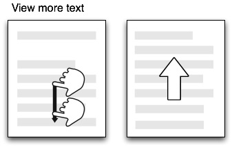
Nature's app, unlike all the others I've seen so far, doesn't use PDFs. Instead it uses ePub. Unlike many ePub book readers (including Apple's own iBooks), the Nature app doesn't render the article as a series of pages, but as one continuous document that you scroll down by dragging (it's essentially a web page). You can't zoom the text, but the text size is fine for reading.

Citations
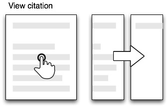
Citations in the body of the article are links. If you tap them the full citation slides in from the right, with a link to the publisher's website. If you tap the link the app opens the website within the app. This can be a little jarring as you move from a customised view of an article to a web page designed for a desktop. In the case of a Nature article, it would be more elegant if the app recognised that the cited reference was a Nature article and rendered it natively in the app. More generally the transition between app and website might be less jarring if journal publishers developed mobile versions of their websites.

Figures
The figures aren't displayed directly in the body of the article, but each mention of a figure in the body of the text is a link. Tapping the link causes the figure to slide up from the bottom of the screen. A button in the top right hand corner enables you to toggle between displaying the figure and it's caption (shown as white text on a black background). You can use pinch and spread to zoom in and out of the figure, as well as save it to the photo library on your device.

Summary
I've started with the Nature app as I think it's the only one so far to seriously tackle the challenge of displaying an article on a mobile device. Instead of displaying PDFs it repackages the articles in ePub format and the result is much more interactive than a PDF.
I hope to explore other article viewing apps in later posts, but it's worth noting that we should also be looking at other apps for ideas. Personally I really like the Guardian's iPhone app, which I use as my main news reader. It has a nice gallery feature to display thumbnails of images (imagine a gallery of an article's figures), and uses tags effectively.